UI component library for UI builder in Connect Customer
All of the UI builder components are described in the Connect Customer UI
component documentation
You access the library components in the UI builder in the Create panel, the Library tab. The following image shows an example of the Library tab and the Container components.
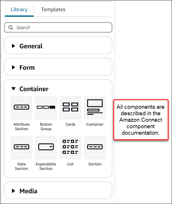
Use Containers to move and organize components
Containers are a core building block to make views. You can move UI components (including other containers) into a container to group them together logically and visually on the page.
To keep the contents of the page relatively consistent as you customize the top level view settings, we recommend using containers in all of your views. Containers also come with column layout. Column layout allows you to organize the contents within a container.
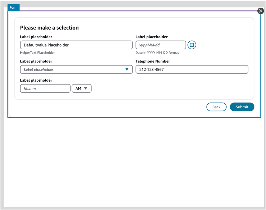
Create a form
To create a form for agents or customers to complete and submit, you use the
Form
-
Drag and drop a Form component onto the canvas from the UI library.
-
Or, from the Templates tab, select the Form Example template. It uses a form component.
A Form
The following image shows an example Form component with placeholder labels and a Submit Button.