Customize your Connect Customer dashboard
You can customize specific widgets to create dashboards that best fit your business needs. For example, you can create a single line chart that combines contacts queued, average queue answer time, and abandoned contacts. You can apply filters to show your most important queues so you can quickly see how increasing contact volumes impact both wait time and customer abandonment rates.
You can delete or add new metrics, define widget level filters and groupings, re-order and re-size columns, and more. Additionally, you can add new custom metrics to specific widgets in your dashboards. For more information, see. Custom metrics.
Contents
Choose which metrics to display in a widget
-
In a widget, select the Actions icon and then choose Edit. The following image shows the Actions icon for the Performance overview widget.

-
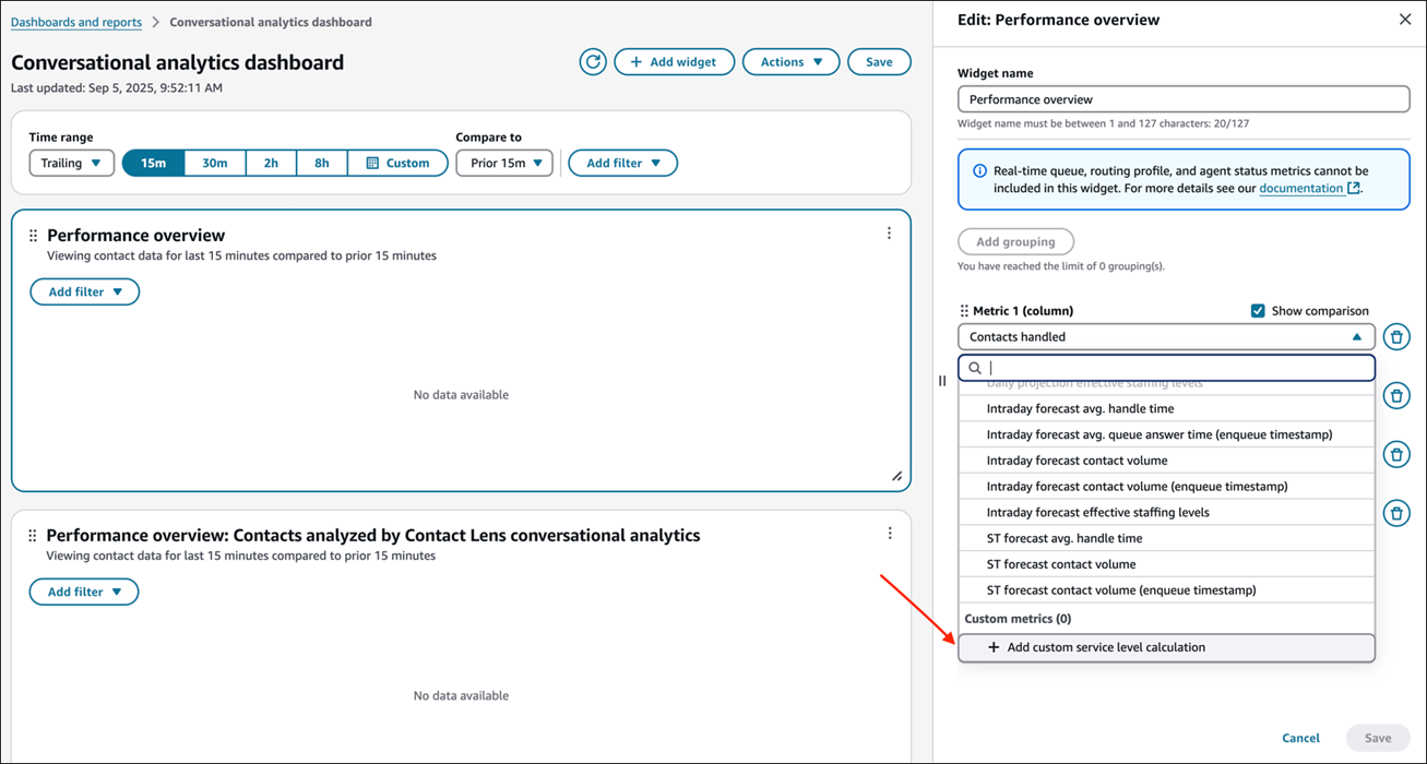
In the widget's Edit pane choose the metric column you want to change; the available metrics for that column appear in the dropdown list.
The following image shows a widget Edit pane, the Widget name box (which you can edit), and the dropdown list available for the Metric 1 column of the Performance overview widget.

Note
In only specific widgets you can select the following real-time queue, routing profile, and agent metrics. You cannot combine these metrics with trailing near real-time metrics or historical metrics.
-
Agents online
-
Agents available
-
Agents in error
-
Agents in NPT
-
Agents staffed
-
Agents on contact
-
Agents online
-
Agents in ACW
-
Contacts active
-
Contact availability
-
Oldest contact
-
Contacts in queue
-
Select custom time thresholds
In the widget's Edit pane you can select custom time thresholds for metrics such as Service level, Contacts answered in X, and Contacts abandoned in X. To select a custom time threshold, choose Add custom, as shown in the following image.

You can then select and choose which time threshold you want. The limit is between one second and seven days. The following image shows the dialog box for adding custom values for the Contacts resolved by X metric.

Re-order the metrics
In the widget's Edit pane you can re-order the columns for the metrics by selecting the dots next to the metric and moving the metric up or down the Edit pane.

Re-size columns
To re-size the columns in the dashboard, select the vertical bars in the column headers and drag left or right to re-size. You can also re-size the grouping column. The following image shows a vertical bar on a dashboard.

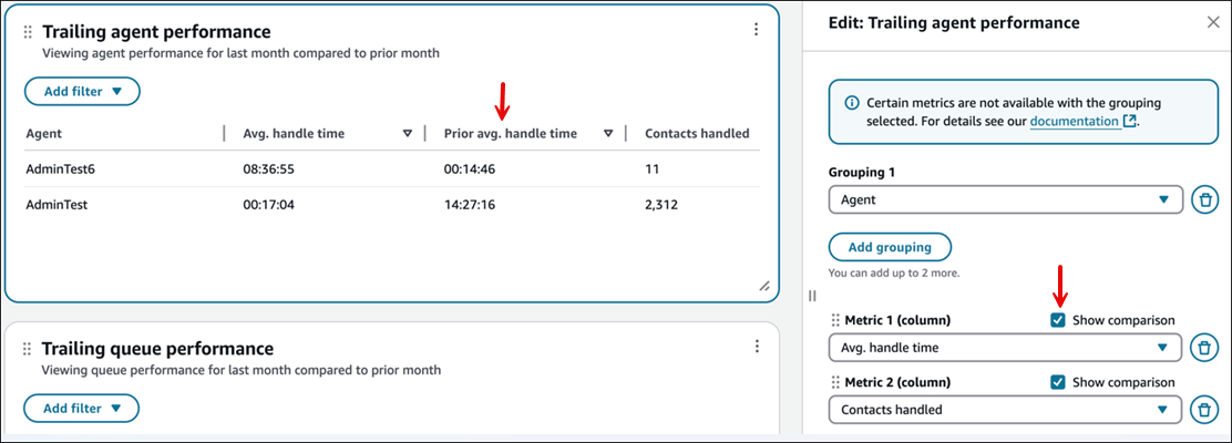
Add comparisons to the Trailing performance widgets
In the widget's Edit pane you can choose to show the comparisons in your Trailing performance widgets by choosing the Show comparison option. This allows you to see how your performance compares to the previous time range.
Configure groupings
In the widget's Edit pane you can configure the groupings for tables. You can add up to three groupings.
Note
-
Groupings are available dynamically based on the metrics selected in the widgets to avoid incompatible metric/grouping combinations.
-
Groupings change the metrics that are available within the widgets.
The following image shows two groupings for the Contact categories widget in the Edit pane.

Configure filters
In the widget you can select filters that apply to only to the widget you're on. These filters are dynamically included based on the metrics selected.
The widget-level filters override any page-level filters.
The following image shows filters for the Trailing agent performance metrics.

Modify thresholds for summary widgets and tables
You can add color coded thresholds to summary widgets and tables by choosing the Modify thresholds option on the widget.

You can add up to three thresholds per metric (red, yellow, green). You can define the thresholds that cause the metrics to change colors. Thresholds are evaluated in the order they are applied, which means that if you have overlapping thresholds, the first one that triggers, will color the respective metric. This means if you want to create a red/yellow/green configuration for greater than 90% green, between 90%-70% yellow, and less than 70% yellow, you should create three conditions in the following order:
-
Greater than or equal to 90% = Green
-
Greater than or equal to 70% = Yellow
-
Less than 70% = Red

Add or remove widgets on a dashboard
You add widgets to a dashboard by choosing from a list of pre-configured widgets that is based on the dashboard you are using. You can have up to 10 widgets on each dashboard.
To add a widget
-
On the dashboard page, choose Add widget, as shown in the following image.

-
On the Add widget page, select a widget from the list of pre-configured widgets based on the dashboard you are using. The widget is added to the bottom of the dashboard.
The following example of an Add widget page shows five Contact widgets that you can add.

When you add a custom widget to the dashboard, you can apply both a widget-level filter and a page-level filter.
The widget-level filters override any page-level filters. For example, you have two queues:
-
Queue1 is filtered at the page level.
-
Queue2 is filtered at the widget level.
In this example, the widget would filter by Queue 2 and other widgets on the dashboard would filter by Queue 1 at page level.
To remove a widget from your dashboard, choose the Actions icon and then choose Remove, as shown in the following image.

Move and resize widgets
You can move charts around by choosing and holding the move icon with your mouse and then moving the widget. You can re-size widgets by choosing and dragging the resize icon with your mouse. These two controls are shown in the following image.

Create custom dashboards
To create a custom dashboard, on the Dashboards tab choose Create custom, as shown in the following image.

A new custom dashboard opens. Use the Add widget option to customize the dashboard.
Create custom calculations of service level metrics
You can create custom calculations of service level metrics to measure the percentage of contacts handled within your specified time threshold.
Complete the following steps to create a custom calculation.
-
Log in to Connect Customer admin website using an Admin account, or an account that has the following permissions in its security profile:
-
Analytics and Optimization - Access metrics - Access permission or the Dashboard - Access permission.
-
Analytics and Optimization - Custom metrics: These permission enables users to view, create and manage custom metrics.
-
-
From any dashboard widget, select the Actions icon and then choose Edit.
-
In the metric selection dropdown, under Custom metrics, choose Add custom service level calculation, as shown in the following image.
-
In the Add custom service level calculation form, configure the following settings:
-
Metric name:- Enter a unique name (maximum 128 characters)
-
Description (optional): Provide details about the metric's purpose (maximum 500 characters)
-
Target time: Specify the service level threshold.
-
Length: Enter a value between 1 second and 7 days
-
Unit: Select seconds, minutes, hours, or days
-
-
Excluded contact outcomes: Choose which types of contacts to exclude from the denominator:
-
Contacts transferred
-
Contacts resulted in callbacks
-
Contacts abandoned in X seconds/minutes/hours/days
-
-
-
The service level calculation preview updates automatically as you configure these settings.
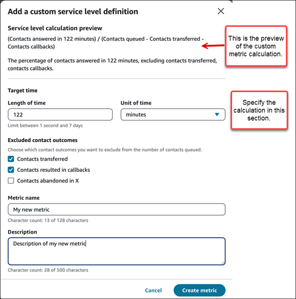
The preview shows:
-
The calculation formula.
-
A plain language explanation of what the metric measures.
-
The percentage of contacts answered within your target time, excluding any contact types you specified.
-
Limitations
-
You can add up to 10 custom metrics to a widget.
Use custom service level metrics in dashboards
After creating a custom service level metric, you can add it to any dashboard widget. Complete the following procedure.
-
From any dashboard widget, select the Actions icon, and then choose Edit.
-
In the metric selection dropdown, locate your custom metric under the Custom metrics category.
-
Select your custom metric to add it to the widget.
-
Configure any additional widget settings like time range, comparisons, or filters.
-
Choose Save to apply your changes.
