Viewing the CloudWatch RUM dashboard
CloudWatch RUM collects and visualizes application performance data from user sessions through an interactive dashboard. By capturing load times, Apdex scores, device information, geolocation, and error patterns, teams can quickly identify performance bottlenecks, prioritize fixes based on real user impact, and ensure optimal experiences across different browsers, devices, and geographic regions—helping organizations better understand user behavior leading to reduced end user frustration and improving application reliability.
Getting Started with CloudWatch RUM
Open the CloudWatch console at https://console.aws.amazon.com/cloudwatch/
. -
In the navigation pane, choose Application Signals (APM), RUM.
The RUM console displays the Overview page, which provides a consolidated view of all your app monitors, their health, and key operational metrics. From the Overview page, select an app monitor to access detailed views with Performance, Errors, Sessions, Metrics, and Configuration tabs.
Overview
The Overview page is the landing page of the CloudWatch RUM console. It provides a high-level summary of all your application monitors, helping you quickly assess health, performance trends, and operational coverage across your monitored applications.

Summary cards
At the top of the Overview page, four summary cards provide an at-a-glance operational status across all your app monitors:
-
Needs attention (by health status) — Shows how many app monitors require attention out of the total, broken down by Critical and Degraded counts. A progress bar indicates the proportion of monitors needing attention.
-
Trending worse — Shows how many app monitors have a worsening trend out of the total.
-
Setup and coverage — Shows how many app monitors have no SLOs configured and how many have tracing disabled, helping you identify gaps in your monitoring setup.
-
SLOs and Alarms — Shows the number of breached SLIs out of total SLIs, and the number of alarms currently firing.
Quick filters
The left panel provides quick filters to narrow the application list by:
-
Platform — Web, iOS, or Android.
-
Health — Healthy, Critical, Degraded, or No data.
-
SLI status — Healthy, Unhealthy, or No SLOs.
-
Tracing — Enabled or Disabled.
-
Trend — Worsening, Improving, or Stable.
-
Primary issue — Filter by the primary issue type affecting the app monitor.
Choose Clear filters to reset all filters.
App Monitors table
The App Monitors table lists all your app monitors with the following columns:
-
Name — The name of the app monitor, with a platform icon (Web, iOS, or Android).
-
Sessions — The number of sessions recorded in the selected time range, displayed with a bar chart visualization.
-
SLI status — The status of service level indicators. Displays the count of unhealthy SLIs (for example, "1/2 Unhealthy") or a Create SLO link if no SLOs are configured.
-
Health — The health status of the application: Healthy, Critical, Degraded, or No data.
-
View Insights — Choose this link to open the diagnostic side panel for the app monitor (see Diagnostic side panel).
-
Primary issue — The primary issue type affecting the application. For web app monitors, values include JS errors, Perf, or HTTP errors/faults. For mobile app monitors, values include Crashes, ANRs/App Hangs, Perf, or HTTP errors/faults.
-
Trend — A description of the trend direction and magnitude (for example, "JS errors +1% worse sessions" or "Perf +81% worse sessions").
-
Tracing — A View traces link if tracing is enabled, or an Enable tracing link if it is not.
-
Services — The SLI health status for linked services (for example, "1/1 Unhealthy"), or a dash if no services are linked.
-
Last event received — The time since the last telemetry event was received (for example, "1 minute ago" or "No events received in the past 4 weeks").
Use the search bar above the table to find specific app monitors by name. You can sort the table by clicking column headers, and use the gear icon to customize which columns are visible. The Actions dropdown and Add app monitor button let you manage your app monitors directly from this page.
Health status
The Health column provides an at-a-glance assessment of each application's operational state based on the percentage of impacted sessions—sessions with errors or slow page loads—relative to total sessions in the selected time range.
Each app monitor displays one of the following statuses:
| Status | Impacted sessions | Description |
|---|---|---|
| Healthy | Less than 1% | The application is operating within normal parameters. |
| Degraded | Between 1% and 5% | The application is experiencing elevated error rates or degraded performance that may require attention. |
| Critical | More than 5% | The application is experiencing significant errors or performance issues that require immediate investigation. |
| No data | — | Insufficient data is available to determine the application's health status. This can occur when an app monitor has not received recent telemetry data. |
Diagnostic side panel
When you choose View Insights for an app monitor in the table, a diagnostic side panel opens on the right side of the page. The panel displays the app monitor name and provides two tabs:

Health tab — Shows a breakdown of errors contributing to the health status (for example, JS errors, HTTP errors (4xx), and HTTP faults (5xx)) with color-coded indicators. The Metrics section displays interactive time-series graphs. Click on a point in the graphs to view correlated sessions.
For web app monitors, the following graphs are displayed:
-
Page views — The count of page views over time.
-
Page load time (p75) — The 75th percentile page load time in seconds.
-
JS errors — The count of JavaScript error sessions over time.
-
HTTP errors — The count of HTTP 4xx errors and 5xx faults over time.
For mobile app monitors (Android and iOS), the following graphs are displayed:
-
Screen load time — The screen load time over time.
-
Screen loads — The count of screen loads over time.
-
Crashes — The count of crash sessions over time.
-
App Hangs/ANRs — The count of App Hang (iOS) or ANR (Android) sessions over time.
-
HTTP errors — The count of HTTP 4xx errors and 5xx faults over time.

Below the metrics, the panel also shows:
-
Breached SLOs — A table listing any SLOs in a Breaching state, with links to the SLO details.
-
Alarms in ALARM state — A table listing any alarms currently firing for the app monitor.
Correlated sessions tab — Shows sessions correlated to the selected data point in the metrics graphs.
Web Application Dashboard
When you select a web application monitor, you'll see the following tabs:
-
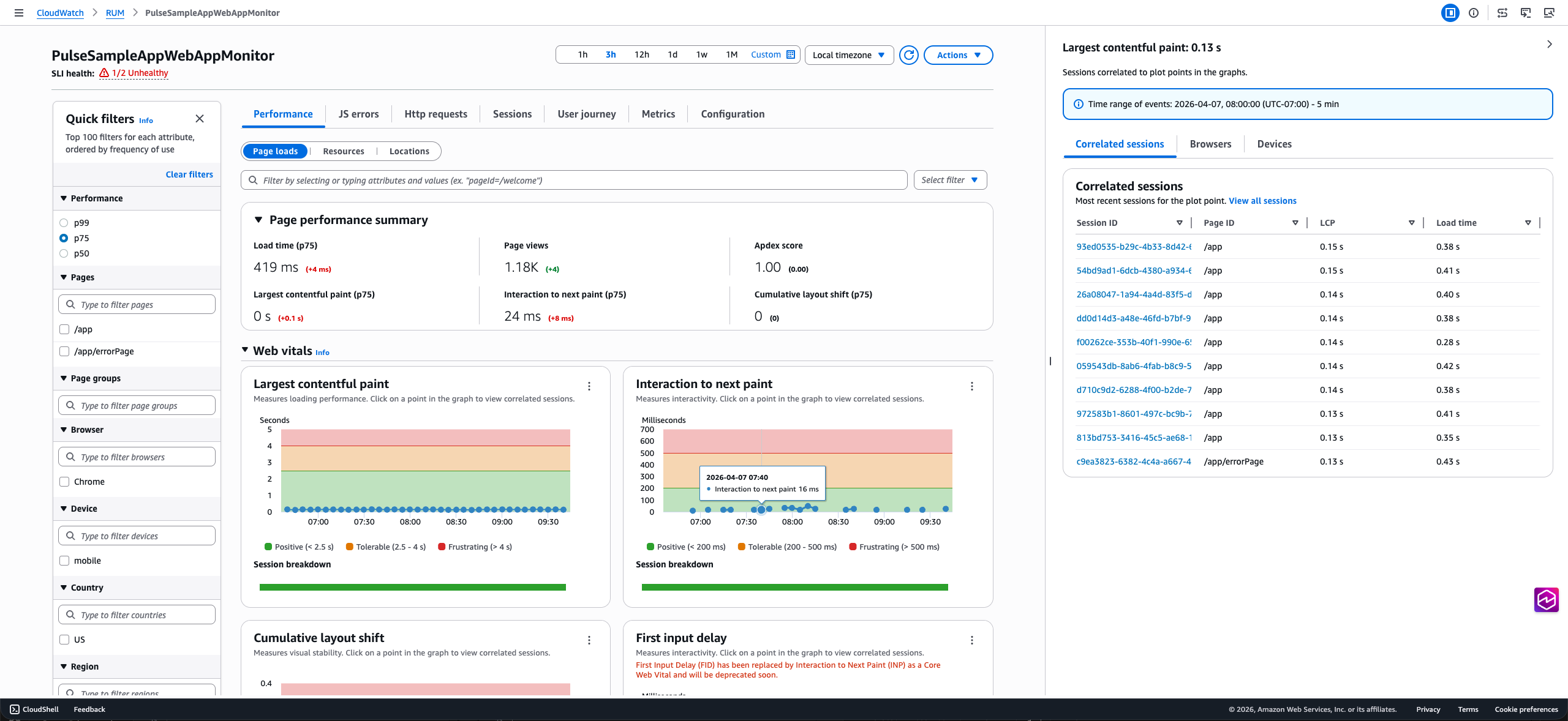
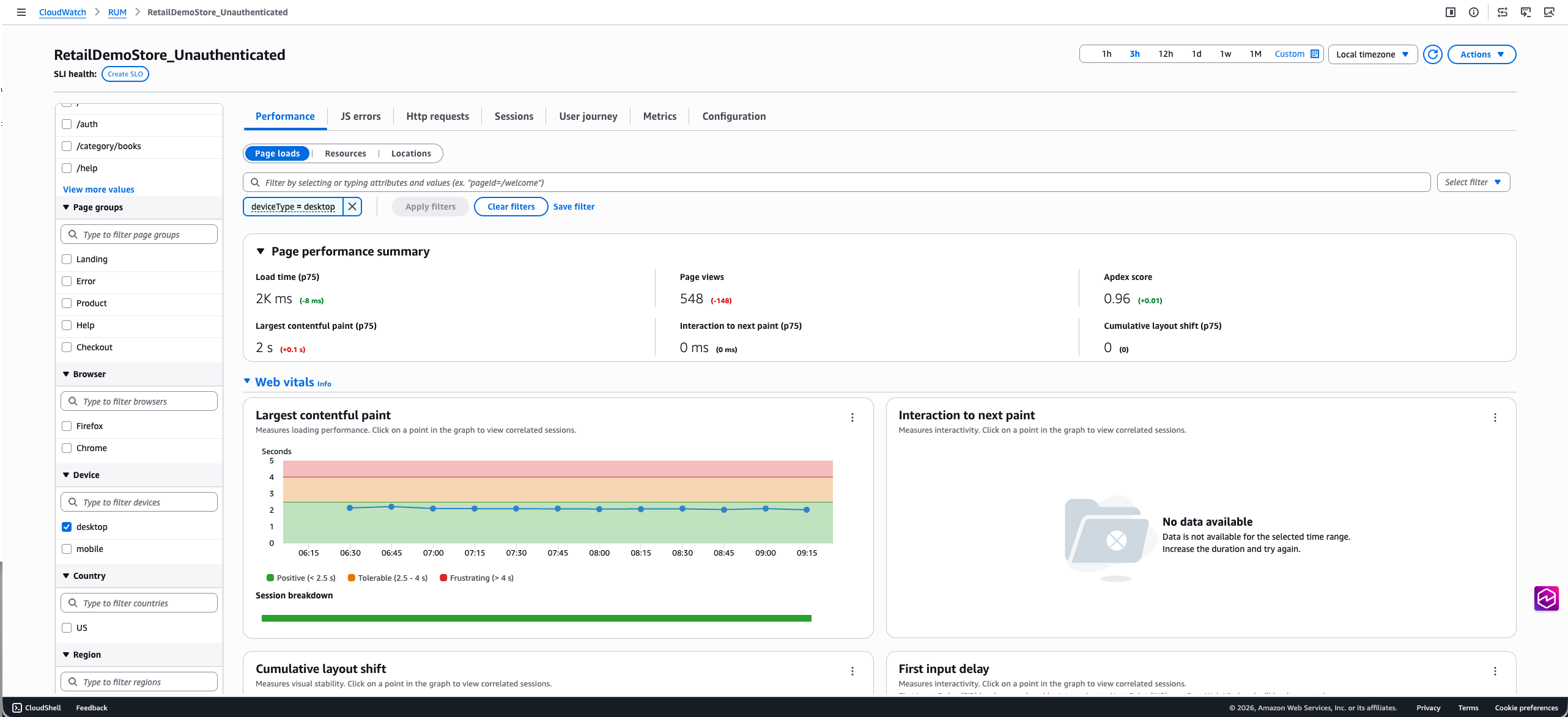
The Performance tab displays page performance information including load times, request information, web vitals, and page loads over time. On this tab you can also toggle the view between Page loads, Resources, and Locations to see more details about page performance.
The Page loads view features interactive web vitals graphs where you can see the different percentile values of core web vitals for your pages and choose datapoints on the graph to view correlated sessions captured by CloudWatch RUM. From there you can navigate to the Sessions tab using one of the links in the diagnostic table to identify specific conditions causing performance issues. The tab also features the application performance index (Apdex) score which indicates end users' level of satisfaction. Scores range from 0 (least satisfied) to 1 (most satisfied). The scores are based on application performance only. For more information about Apdex scores, see How CloudWatch RUM sets Apdex scores. The table at the bottom lists the Top 100 page load times based on Page Ids. You can change this attribute in the dropdown next to the table header.
Similarly the Resources view shows the resource request time and count by the resource type. The Locations view has interactive map that lets you drill down to a more granular view and investigate performance issues in a specific region.

The diagnostic panel on the right also has the Browsers and Devices tab which shows the top 5 browsers/devices contributing to the performance issue. You can click on the bar chart to navigate to the Sessions tab to further investigate the issue.

-
The JS errors tab displays JavaScript error count and rate in the summary component along with the Browser and Device with the most errors. This tab includes a chart which shows the number of sessions with JS errors and the failure rate. You can click on any data point in the chart to view the correlated sessions in the diagnostic panel. The table at the bottom lists the top 100 JS errors. The error count link in the table can be used to navigate to the sessions tab where you can view relevant sessions.

-
The Http requests tab displays HTTP request volume and error information in the HTTP request summary on the top. This tab includes a graph with the HTTP errors, HTTP faults and Network failures. You can click on any data point in the chart to view the correlated sessions in the diagnostic panel. The table at the bottom lists the top 100 network routes with issues. If you expand one of the rows you can see the top error messages for that url. The error count link in the table can be used to navigate to the sessions tab where you can view relevant sessions.

-
The Sessions tab displays a table that lists all sessions in descending chronological order. At the bottom, a waterfall visualization shows all telemetry for the selected session, helping you track user interactions and identify performance issues. You can click on the error link in the Errors column to filter the waterfall chart for the specific error event. Each row in the waterfall can be selected to open the diagnostic panel where you can view the raw event.

For HTTP requests, you'll see a traceId for HTTP and Xray events that links to the Traces console if you have tracing enabled. For events like JS error or HTTP error events, diagnostic panel includes an Exception tab with the stack trace. The View button in the waterfall provides quick access to this information.

-
The User Journey tab displays the paths that your customers use to navigate your application. You can see where your customers enter your application and what page they exit your application from. You can also see the paths that they take and the percentage of customers that follow those paths. You can pause on a node to get more details about that page. You can choose a single path to highlight the connections for easier viewing. The page shows user journey till 2nd interaction by default. You can click on the Add path button to view further interactions.

-
The Metrics tab displays all default CloudWatch metrics published by your app monitor, including performance web vitals, error metrics (JavaScript errors, HTTP errors/faults), volume, user flow and apdex metrics. If you created extended metrics for your application, the tab also includes a subset of these metrics in the extended metrics section. This subset includes metrics of type PageViewCount, PerformanceNavigationDuration, Http4xxCount, Http5xxCount and JsErrorCount. The dashboard shows three metric variations per metric type. Since these are CloudWatch metrics, you can also export this tab to your own dashboard using the Add to dashboard option and update it to include more metrics.

(Optional) On any of the first five tabs, you can filter the data based on user ID, session ID and other event specific filters using the filter bar on the top. You can also use the quick filter panel on the left to filter on a subset of attributes like Page IDs, Page groups, Device, Browser, Location. These filters can be saved using the Save filter option and can be reused using the Select filter dropdown next to the filter bar.
Mobile Application Dashboard
When you select a mobile application monitor, you'll see the following tabs:
-
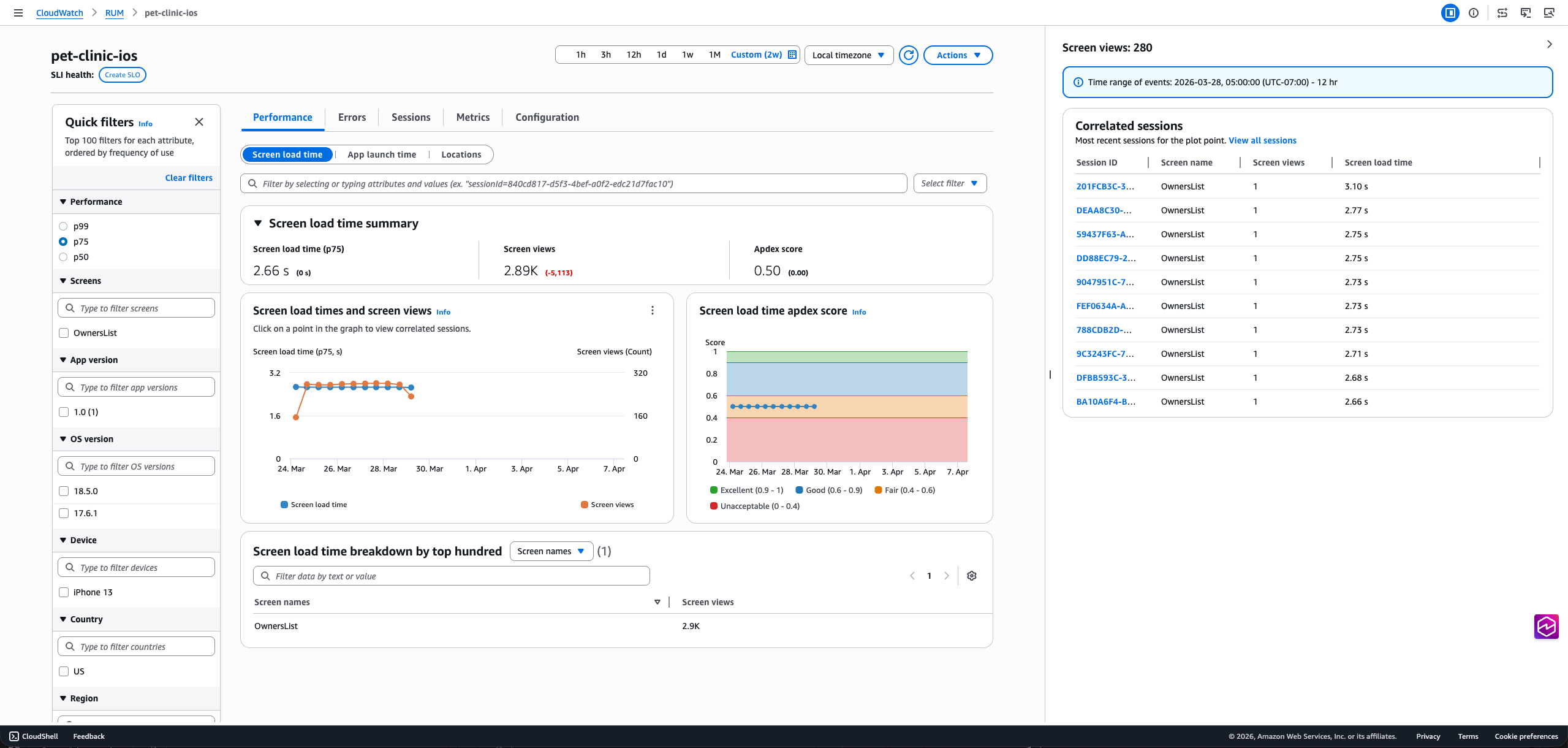
The Performance tab provides insights into the performance of your mobile application including screen load times, app launch times (cold and warm), performance metrics, and Apdex scores over time. The detailed view breaks down performance by screen names, OS versions, app versions, devices, and countries. Clicking a screen load time, app launch time, or location datapoint in the chart will open the diagnostic panel on the right that provides further insights relevant to the datapoint consisting the most recent correlated sessions and links to the Sessions tab for troubleshooting.
On this tab you can also toggle the view between Screen loads, App launches, and Location to see more details about application performance.
The tab also features the application performance index (Apdex) score which indicates end users' level of satisfaction. Scores range from 0 (least satisfied) to 1 (most satisfied). The scores are based on application performance only. For more information about Apdex scores, see How CloudWatch RUM sets Apdex scores.
-
The Errors tab breaks down application issues in three categories: Network Errors, Crashes, and ANRs (Android)/App Hangs (iOS). The Network Errors tab has a line chart showing network latency, client errors (4xx status code), and server errors (5xx status code). Clicking on a data point for any of these lines in the chart will open the diagnostic panel. The bottom table lists the 100 most common network routes. Clicking on a radio button will filter the line chart by the network route selected.
Similarly, the Crashes and ANRs/App Hangs tabs show a line series for the count of each error, and these are intractable. The bottom table displays the most common top crash message or ANR/App Hang stack trace. Clicking on a radio button will filter the chart, and clicking the error message will show the complete stack trace.

-
The Sessions tab displays a table that lists all sessions in descending chronological order. At the bottom, a waterfall visualization shows all telemetry for the selected session, helping you track user interactions and identify performance issues. Each row in the waterfall can be selected to open the diagnostic panel. For HTTP requests, you'll see a traceId that links to the Traces console.
For HTTP requests with non-2xx status codes, crashes, or ANRs (Android)/ App Hangs (iOS), the diagnostic panel includes an Exception tab with the stack trace. The View button in the waterfall provides quick access to this information.

-
The Metrics tab displays all default CloudWatch metrics published by your app monitor, including performance metrics (screen load times, cold app launch times), error metrics (crashes, ANRs/App Hangs, HTTP errors/faults), volume and apdex metrics. If you created extended metrics for your application, the tab also includes a subset of these metrics in the extended metrics section. This subset includes metrics of type ScreenLoadTime, ScreenLoadCount, CrashCount, Http4xxCount, Http5xxCount, ANRCount/AppHangCount, ColdLaunchTime and WarmLaunchTime. The dashboard shows three metric variations per metric type. Since these are CloudWatch metrics, you can also export this tab to your own dashboard using the Add to dashboard option and update it to include more metrics.
-
The Configuration tab provides access to your app monitor's general settings and configuration details. You can also access the Code snippets tab which contains instructions for instrumenting your mobile application with the ADOT SDK, including both Manual and Zero-Code instrumentation options.
How CloudWatch RUM sets Apdex scores
Apdex (Application Performance Index) is an open standard that defines a method to report, benchmark, and rate application response time. An Apdex score helps you understand and identify the impact on application performance over time.
The Apdex score indicates the end users' level of satisfaction. Scores range from 0 (least satisfied) to 1 (most satisfied). The scores are based on application performance only. Users are not asked to rate the application.
Each individual Apdex score falls into one of three thresholds. Based on the Apdex threshold and actual application response time, there are three kinds of performance, as follows:
-
Satisfied— The actual application response time is less than or equal to the Apdex threshold. For CloudWatch RUM, this threshold is 2000 ms or less.
-
Tolerable— The actual application response time is greater than the Apdex threshold, but less than or equal to four times the Apdex threshold. For CloudWatch RUM, this range is 2000—8000 ms.
-
Frustrating— The actual application response time is greater than four times the Apdex threshold. For CloudWatch RUM, this range is over 8000 ms.
The total 0-1 Apdex score is calculated using the following formula:
(positive scores + tolerable scores/2)/total scores * 100
